Clayton Morris’ First Impressions of the Apple Watch

Clayton Morris posted his first impressions of the Apple Watch after using it for only 30-minutes. He starts with his current iPhone usage patterns:

I waste a lot of time using my phone. Here’s an example: A text comes in and a full ten minutes later I’ve responded to the text, opened my email but didn’t respond to any emails, surfed the web, logged my lunch in Lose It, responded to a follow up text, checked the weather, popped over to my podcast app, read a few news headlines, responded to another follow up text. All of this happening while one of my children asked a question that I probably missed.

From there, he explains very clearly how he feels the Apple Watch will remedy this problem. It’s a great, succinct read that may answer the question, “why would I buy an Apple Watch?”


The MacBook’s Disappearing Ports

MacBook Retina 2015

Apple Inc.

In addition to announcing pricing and availability for the Apple Watch at their “Spring Forward” event, Apple also announced an all new MacBook laptop that boasted some interesting features and specs. The MacBook includes an all-new keyboard with butterfly switches, a new trackpad implementation with haptic feedback and pressure sensitivity, a 12” display (226 ppi), and up to nine-hours of battery life (under general use), all in an amazingly thin profile of only 13.1 mm. In typical Apple fashion, they managed to squeeze all of this into a beautiful enclosure and keep it at just two-pounds.

With all the “new” surrounding this announcement, it wouldn’t be an Apple event without controversy. Apple decided to only include a mini audio jack, and a single USB-C port for both expandability and charging. Based on the responses I have read online, you would’ve thought that Apple retired from making computing devices and moved to their real passion: rock garden design.

This isn’t the first time Apple stirred up emotions while making changes to their products:

  • 1998: Apple introduced the iMac, which opted to use the fledgeling USB port in favor of the familiar ADB serial port, and eliminated the floppy drive altogether
  • 2008: Apple introduced the MacBook Air, which dropped the optical drive and only included one USB port, a mini audio jack and a Micro-DVI video port
  • 2011: Apple introduced a new Mac Mini model, which dropped the internal optical drive
  • 2012: Apple introduced a new iMac model, dropping the internal optical drive to acquire a more sleek profile
  • 2013: Apple introduced the completely redesigned Mac Pro, dropping the internal optical drive bays, HDD/SSD drive bays and main-board expansion card slots

It’s in Apple’s nature to only include what they feel is needed, removing those technologies that are either unnecessary or approaching obsolescence. With the new MacBook, they are aiming it at general laptop users who very rarely plug in expandable hardware.

Integrating only one USB-C port may seem like a horrible decision to the more advanced computer users, but they must remember that they’re usage patterns are not the norm. I can understand the concern with having to share one port for both expandability and recharging the laptop’s battery. If it weren’t for my iPad — which suffers the same issue — I would probably weigh more heavily on this potential issue.

To get a better sense of how this change would affect users, I looked to the most likely candidate of the new MacBook: my wife. She has an older model MacBook; one with ports galore and even a separate MagSafe port. In all the years that I have witnessed her use it, I have never seen more than one device/cable plugged in at a time. She logs onto our network wirelessly, prints wirelessly to our home printer and shares files wirelessly. When she wants to share her music, photos or screen on the TV, she does so wirelessly via our Apple TV. With the exception of a USB thumb drive, I can’t think of a single reason why she would use her ports.

Apple is showing us where they believe portable general computing is headed with the new MacBook. A world without unnecessary cables and weight, allowing the portable computer to be truly portable. And while it may be a shock to the system today, this reaction is nothing new. I can’t remember the last time I used a floppy disk, but when Apple dropped it from their lineup in 1998 we experienced the same reaction: fear of change.


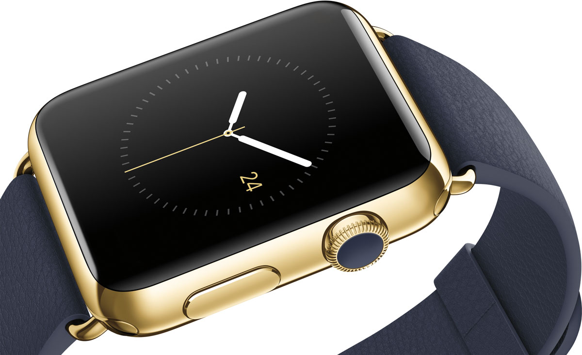
Apple Watch Edition — It’s Not for You

Apple Watch Edition

Apple Inc.

With the recent announcement that the Apple Watch Edition (the 18k gold version) would start at $10,000, the tech press has reacted in an unsurprising manner. They questioned if Apple had gone too far. They wondered how Apple could justify such a premium price tag. All of this confusion makes sense, though, if you are from the same camp that argues that Apple needs to create cheaper products.

The Apple Watch Edition is not for the masses, it’s for the few. It’s aimed at people who spend $10,000 without a second thought and who would like to wear the Apple Watch but wouldn’t be caught dead with a non-gold accessory adorning their wrist. It’s a small pool of people who meet this description, hence why Apple has limited production of the Edition.

If you are sweating the $10,000 starting price of the watch, then you are not the target demographic.


New Mac Pro and Apple Logo Placement

I find it interesting that the new Mac Pro design places the Apple logo on the back of the unit.

Mac Pro

Apple Inc.

It’s such a unique design for a computer workstation, so unique that a logo is not needed to help differentiate it from the competition.


Apple Gets What It Wanted With New Google Maps

Unless you have been living under a rock, Google Maps has been released for iOS devices on the App Store. Even though 74% of Apple Maps users are satisfied, this is still great news nonetheless—they now have a native app that ties into Google Map’s architecture and data.

What does this mean to Apple?

Simple: they got what they wanted without having to compromise.

Apple originally wanted Google to bring turn-by-turn directions to the original iPhone Maps app, but Google asked for more than Apple was willing to deliver on. Instead of waiting around, Apple set off to build their own maps app and remove Google from the equation, literally. Up until today, if you were on an iOS 6 device, your only way to access Google Maps was via the web.

What does this mean to Google?

To tap into the iOS user base you have to play by Apple’s rules. Judging by the fact that Google released Maps for a competing platform, the users must be worth a lot.

What does this mean for the iOS user?

One additional choice. As a Navigon user, I already enjoy a great mapping solution with Street View built-in, so I am not sure what benefits Google Maps will bring to the table for me. But if you are part of the 26% unsatisfied by Apple Maps, and do not want to pay for an alternative, Google Maps is a great option. Just make sure you have a signal because Google Maps does not support offline maps.

« Prev
1
23
1415Next »